Showing posts with label 1890s. Show all posts

18 Nov 2017

Investment Pieces for the Home: Rose Uniacke

If money is no object and the object of our affection is an interior exuding European old money grandeur, a trip to Rose Uniacke's furniture showroom and interior design studio in Pimlico, London, beckons. The interiors' Queen of Serene will help you make it happen and morph your dream home into a reality.


Rose's credentials are rock-solid and her offering a one-stop shop. Her knowledge base as both an interior and product designer, in addition to her understanding of family-friendly, functional, cosy personable interiors, combine with her invaluable experience as an antiques dealer, fabric designer, gilder, paint and lacquer specialist and furniture restorer, her respect for the history and style of the buildings they sit within, the importance of sensible renovation involving the cream of craftsmen and experts in order to turn the house into a workable and lovable space with its integrity of character, and the carefully-curated heirloom objects that weave a fine balance of form and function into the canvas of the property. 

Rose translates her clients's wishes and expectations into homes that intimately fit their personality: homes that are an extension of who they are. Her client base includes household names such as David and Victoria Beckham and perfume maestro Jo Malone, should you care to know. As may be judged from her portfolio, Rose is used to juggling £multi-million property renovation contracts, without compromising on craftsmanship or style. Cleverly mixing the old and the new in a balancing act only she knows how will usher you to the past without nostalgia while by the same token keep you in the present with a well-honed sense of history. Your home is in safe hands with Rose Uniacke and her team.

Arts & Crafts Repoussé Lantern, England, c.1900 (£2,700/ $3,569)

Now here is my shortlist of unique pieces which no home with a healthy cashflow should be without. I do admit the prices are extravagant but do not let this hold you back if you are prepared for style no matter the cost! Bear in mind the pieces are bold, unique and in good condition.

Source: (1-5) Rose Uniacke's Pimlico home is a pared-down affair that peeled off the layers of successive conversions to its bare walls, complete with restored plasterwork and mouldings. The 19th century property was originally a professional artist’s combined studio, gallery and private residence. It was later converted into a smaller residence flanked by four apartments. Rose reverted it back to a family home, complete with wine cellar and interior courtyard plus the modern conveniences of home cinema, spa and pool - without betraying the essence of the building. In such a setting, heirloom pieces like the (3) 19th century waterfall chandelier (attributed to the Spanish Royal Glassworks), effortlessly come to life. More photography from the Vogue slideshow and article (March 2017), photography by François Halard. (6-8) Antique items available to purchase from the Rose Uniacke online shop. (6) The Arts & Crafts Repoussé Lantern (£2,700/ $3,568.60) will add some Gaudí-esque brass drama to the entrance lobby. (7) The Large French Ormolu Alabaster Hanging Light stands out in style and price, a cool £12,000/ $15,860. The original ormolu bronze includes the foliate mounts and canopy; the veined alabaster dish will bathe your sitting-room in flattering soft indirect lighting. (8) Recently reduced in price, the Finely Cast Victorian Brass Table Lamp by George Smith is almost a snip at £1,100/ $1,454. (9) Note the original three lion-paw feet on a tripod plinth supporting the fluted column.

Large French ormolu alabaster Hanging Light, France, late 19th century (£12,000/ $15,860)
Finely Cast Victorian Brass Table Lamp by George Smith, England, c.1850 (£1,100/ $1,454)
Close-up of the lion-paw feet on a tripod plinth

6 Aug 2017

Corsican Brands That Sparkle - Orezza

There are so many different ways to approach Corsica and describe its fiercely proud spirit, and advertising is one of them. Here are a couple of long-established Corsican brands that set the tone in terms of strong brand identity and notable advertising features.

Both the brands I selected just so happen to be drink-related (one is mineral water, the other a range of alcoholic beverages). It could be that when faced with the unforgiving Summer heat that blesses and curses the Mediterranean island in equal measures, one may get an appreciation as to why thirst quenching is on the mind... followed by a well-deserved apéritif.

But first let's quench our thirst!


Eau d'Orezza:

Bibliothèque Nationale de France

With its 161-year history, Orezza distinguishes itself as the Corsican mineral water par excellence. The longevity stake alone makes it well ahead of the competition, island-wide. And wait for it... In Roman times, the iron-rich sparkling water was already praised for its therapeutic virtues.

In the mid-19th century, the medical profession recognised that the iron-rich water was beneficial for treating anemia, liver and kidney ailments and paludism. A spa establishment was set up in-situ where visitors could take the waters.

Despite competition by cheaper local brands, Orezza remains a staple on Corsican restaurant tables. It is also associated with a number of high-profile Riviera-based sports events. All in all, it remains a success story despite a three-year hiatus in the mid-1990s when the company fizzled out. It was saved from drowning and is now positioned strongly on the market. You could almost say that Orezza is the Corsican San Pellegrino in its own right, and this includes its reversal of fortune.

Napoléon Tête Couronnée, oil on wood by Jacques-Louis David

Orezza water is still being sold in glass bottles to satisfy the purist and the well-heeled but is also available in plastic bottles of different handy formats. Sign of the times, you can buy the water naturelle or with a refreshing hint of mint, grapefruit or citron.

I am unable to date the eagle advert for sure yet from the lettering and art direction I estimate it to be c.1890. The heraldic spread eagle symbolises strength, perspicacity, fearlessness, heritage and immortality. In the Orezza context, one may be tempted to hastily associate it with Emperor Napoléon Bonaparte, Corsica's most illustrious offspring, but such a connection would actually be far-fetched. Besides the eagle representation here is that of a dishevelled bird, whereas Napoléon's was stockier and more polished in looks, not to mention the fact that the crown resting atop the eagle as part of the crest is not the imperial laurel wreath (see above).

Orezza advertising, 2000s

Bear in mind that the classic eagle symbology was resurrected from the Roman empire days by Napoléon. The eagle is popular symbology in heraldry; it is depicted on a variety of royal houses coats of arms and nation flags across the world and as a famous British bank emblem.

These days, Orezza's poster and magazine advertising is of a less solemn and ominous nature than the spread eagle composition. Oh, I love the cheerful vibe that captures what Orezza is really about! Bright, blue, Summery, upbeat and sparkling, featuring a lady who bears an uncanny resemblance to Corsica's modern day muse, Laetitia Casta... I must admit that I only managed to source a poor quality advertising image online, which does no justice to the actual rendering on a glossy upmarket magazine where it belongs, even after a few tweaks. Note to self: fish out my mum's old copies of Kalliste to seek out the full-page advert, scan it and upload it to this post.

Laetitia Casta and friend, photography by Walter Pfeiffer for Vogue Paris, October 2012

Orezza is proving to us that you can be over 160 years old and still be relevant, albeit amongst a bunch of millennials who were likely not brought up on the brand, and be the ubiquitous soft drink on the rallye and party circuit. Cheers to that!

Before you squeeze that slice of lemonn into your glass, make sure to catch Part 2 of our article!

26 May 2017

Frills and Thrills

In her day job, New York Times fashion writer Charlotte di Carcaci ravishes her readers with fashion that goes beyond skindeep - with a researched historical bias. In her leisure, she ravishes her Instagram followers with a delightful riot of frills and thrills of the painted portraiture kind, captured in cropped detail.

'Portrait of Lady Hillingdon', oil on canvas by Sir Frank Dicksee (1905)

Plunging necklines sparkling with bevelled jewels, captivating bosoms hemmed in intricate lacey patterns, fine and delicate shoulders draped in shimmering brocade, virginal waists corseted in acreages of soft ribbon, puffed up sleeves made out of silk, powdered-up diaphanous skin and cascading curled-up locks as canvasses to seamstresses, gold-threaded embroidery turned to an art form, shimmering vaporous fabrics floating about like peony blossoms... And all artistically immortalised by talented painters.

Uncredited
'L'Innocence', by William-Adolphe Bouguereau (circa 1893)

All in all, this is a tale of aristocracy and fine living, old European money that watches its Ps and Qs... on canvas. It almost makes us yearn for the good old days until we remember the privileged lifestyle was essentially out of reach for those outside the tight circles. Unfortunately the portraits are left uncredited by the curator for the most part but we guess that Madame de Pompadour, Pauline Borghese and portraits by Jean-Honoré Fragonard might hide in some of them.

Uncredited (timewise the empire dress hints at early 1800s)
'Young Lady with a Small Dog', by Vittorio Matteo Corcos (circa 1895)

In any case, the carefully-curated catwalk is of a high calibre and depicts how fashion in those days was at least as extravagant and opulent as it can be today. It is also a playful, instructive, delicious and visual-pleasing way of (re-)acquainting oneself with museum treasures of bygone times, all in the noble name of art and fashion. An ode to elegance, to feminity, that is a delight for the eyes!

Uncredited
Uncredited

Sources: (1-8) Charlotte di Carcaci Instagram. If you are able to credit any of the above (uncredited) portraits, please do so in the comments, this would  be so appreciated! (9) 'The Souvenir' by Jean-Honoré Fragonard, via The Athenaeum.

'Queen Charlotte', oil on canvas by Thomas Gainsborough (circa 1781)

Mirabelle couldn't help it! Here are some suggestions - we'll leave it to Charlotte to crop the images:

'The Souvenir', oil on canvas by Jean-Honoré Fragonard (1776-1778)
'Ianthe', oil on canvas by John William Godward (1889)
'Portrait of Anna Pitt as Hebe', oil on canvas by Elisabeth-Louise Vigée Le Brun (1792)
'The Mischievous Puppy', oil on canvas by Emile Vernon (1915)

18 May 2017

Investment Pieces for the Home

I have finally been able to make some space in my place! Thus last week, the storage company brought all my belongings (furniture, kitchenware, electricals, books, tools, clothes and shoes) that had been locked away in storage for over seven years (you read this right, 7 years!) after I moved from the UK to Corsica. At that point, it was a matter for me of rediscovering what was hidden in those boxes because I could not exactly remember what I owned... Talk about the little girl in the treasure trove moment! Yet this made me realise how important it is to keep belongings to a minimum and focus on quality rather than the flat-pack self-assembly combo that is no statement for durability, especially after just one house move.

Flora Pendants by Rothschild & Bickers

Nip clutter in the bud and don't let it build up and control you. In my case, I have never been keen on ornaments but was still surprised to find out I still own way too many of those; they end up being begrudgingly cumbersome as space occupiers and dust collectors - not a good prospect when you live in an already-cluttered house and in the path of the dusty, desert-borne sirocco winds!

A cluster of Flora Pendants in Jade at Motel One München-Sendlinger Tor

I decided years ago that life is too short to be cumbersome and too precious to be cheap. Sometimes you need to carefully splurge on a select few investment pieces that will accompany you down the journey of life and beyond, passed down to the next generation. Quality pieces that do not necessarily shout out hefty price tag, antique heirlooms and vintage memorabilia but that spell out design, elegance, timelessness per se, and a certain uniqueness, in that 'upper' high street parable.

Twinkle, twinkle little light...

First for the cheerful and edible stuff (7 years later, I betcha!), I have happily found a box of designer coffee, upmarket English tea, and fancy sugar cubes neatly packed up. Those will come in handy, and needless to say sprinkle tea-time with a generous spoonful of English nostalgia.

Standing Pendants by Rothschild & Bickers

I'm still not done with my treasure finds, yet I have unwrapped some of what I consider my investment pieces (two of which were cheap as in even a cash-stranded student could afford those!):
  • a Mexican bedframe in repurposed vintage pine and custom-painted (bought from John Lewis before the retail store started losing its edge to the mainstream)
  • a pair of reproduction cast-iron book-ends (cast in original Victorian moulds, and purchased in Ironbridge, Shropshire, a good 20 years ago)
  • a French rococo gilded crystal chandelier, circa 1910 (a bit of a fancy purchase in relation to my budget at the time, from a specialist antiques shop on the Hale end of Altrincham, Cheshire) - yeah the posh end of town...
  • an original copy of Salome by Oscar Wilde, which I randomly came across in some charity shop in Didsbury Village, Manchester (cost me a fiver and at the time was already worth at least £80).

Steel Standing Pendants

Not all my finds were happy finds. I cringed at some of the clothing I had forgotten about (which will be heading the charity shop way soon enough!). I despaired about knick-knacks (presents from friends and family), books (Marketing for Dummies and Photoshop for Beginners type of books that shall not grace any shelves and thus remain tightly packed in boxes until disposed of via eBay).

Opulent Optic Pendants

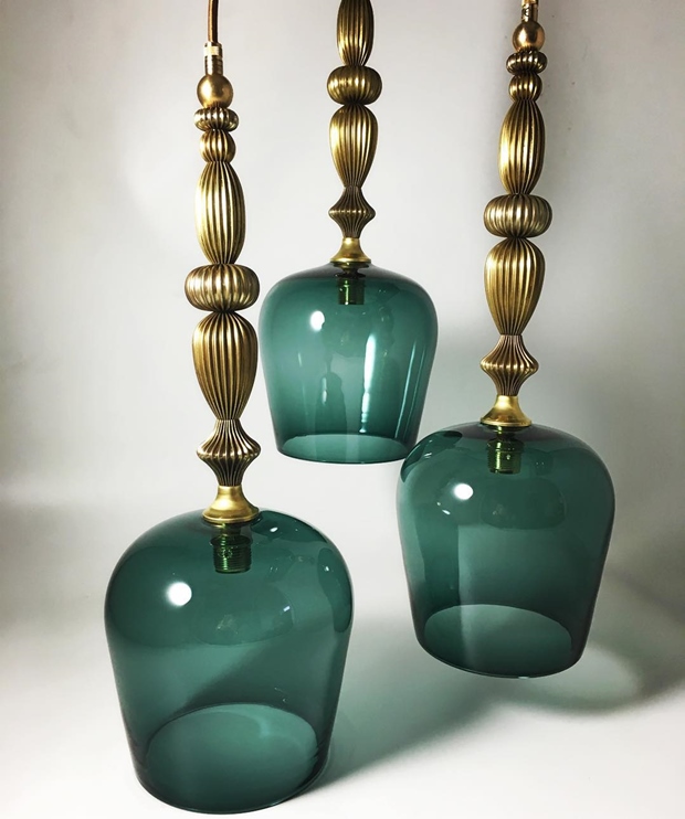
Source: If you are seeking bespoke investment pieces rooted in European manufacturing, traditional handblown glass craftsmanship, and period-inspired pieces revisited through a resolutely clean and modern twist, Rothschild & Bickers is your port of call. The small English company has made it its speciality to turn the mod-con of lighting into an object of desire that will sit at home in antiques-furnished abodes, stately homes, modern environments... and retail outlets alike. Rothschild & Bickers lights will stand the test of time and fads and still spell out a statement steeped in history with a forward-thinking standpoint. No shadow of a doubt about this. My favourite pieces include the (1) Flora Pendants range, retailing at £370 (small) and £440 (large), and (4) the Standing Pendants range, retailing at £520. (2-3) The Flora range blossoms at Motel One München-Sendlinger Tor, Munich, Germany. (5) Bespoke Steel Standing Pendants, photography via Rothschild & Bickers' Instagram account. (6) The Opulent Optic range retails at £370. (7) The Vintage Light (see below picture, to the right) is a styled reinvention of the fringed mid-century affair found in your nan's sitting room and the jumble shop down the road... Attention please! No tired mustard velvet and no dusty chintz here: colours are sharp, the glass dome may be wiped clean with a damp sponge, and the light comes with a wispy fringe of your choice! Make mine the Satinwood Gold. The Vintage Light retails at £440. (8) Talk about customising that investment piece: over 90 flex types available! Photography via Rothschild & Bickers' Instagram account.

A fringe to frame that face
Flexes of your choosing

Investment Pieces for the Home is to become a regular Mirabelle feature. We'll review objects of desire that are set to last the distance and become heirloom pieces in their own right. God forbid, those items you might even profit from, should times get dire and your household require an instant cash injection. Further inspiration from Mirabelle's Pinterest board, Interior Design Delight.

12 Mar 2017

Literary Classics by The Folio Society

The old adage, 'Don't judge a book by its cover', is a cracking old chesnut - especially when aimed at... books! We understand it unwise to base an opinion upon the look of a book alone, and by extension to everything and everyone we come into contact with in life. As much as we are trying to underplay this though, poor artwork does no justice to a good story whatsoever!


A novel, a political treatise, or a poem anthology, for example, might not command the imperious need for illustration per se, yet a little visual wouldn't go amiss. We would expect a few lithographs or photographs for a cookbook, travel guide or garden book - as essential descriptive triggers that entice you to turn your hand to a recipe, visualise a place or identify a particular plant - yet in my life I have come across books within those disciplines that were devoid of such illustrative artefacts. A big let down!

Overall, books with any sort of visual appeal (slipcase, dust jacket, binding, illustrations, endpapers, etc.) are bound to be more eye-catching and engaging than those that puritanically resemble an austere brick on the outside, and open up to an uninterrupted flow of words, cover to cover, without much as a blank page or typographical embellishment to punctuate - lighten up - the flow. War & Peace, anyone?!


Inveterate book worms might shrug this off as a bout of coquettishness, superficiality or distraction on my part. But bear with me on this one; our modern times are so infused with visual stimulus that we find it hard to imagine a book without the seeming artifice of decor. Artifice, come again! If you come across a book you know nothing about, your first opinion will be subjectively based upon its looks. To the design-conscious and those in touch with their feminine side, the book cover is an appetizer, the first encounter, the deal breaker as to whether or not they will wish to find out more about the book, grab it, leaf through it and purchase it... or leave it behind on the shelf and walk away.

A book makes more sense when it is illustrated. It makes it whole; it personifies it and makes it come to life. Of course disaster may strike there too: you do get those books with great word content, marred by a disappointingly poor set of images - I have encountered those in spades! Not helping the final purchasing decision, unless you can just blank them out and concentrate on words alone.


As a niche upmarket publishing company that respects both authors and readers in their expectations, with collector appeal and hence no compromise over quality of detail and creativity, The Folio Society (est. 1947) understands that literary classics deserve impeccable styling. The house delivers "carefully crafted editions of the world’s finest literature". There you are welcomed by creativity across the board and books that are anything but bland, cheap and predictable. Literature is praised and embraced as an art, where it feels special once again. A nice observation to be had when Amazon's mass-consumerism is pretty much crushing out the last gasps of what a great book should be looking like: fine and regal! A beautiful book makes for a beautiful read.

"We believe that great books deserve to be presented in a form worthy of their contents. For nearly 70 years we have celebrated the unique joy to be derived from owning, holding and reading a beautiful printed edition." - The Folio Society

Sources: All books published by The Folio Society, do check out the production credentials! (1)  Paradisaea apoda, illustration by John Gould and William Hart, from A Monograph of the Paradiseidae, or Birds of Paradise by Richard Bowdler Sharpe, 1891–98., © The University of Manchester. Extracted from The Malay Archipelago: The Land of the Orang-Utan and the Bird of Paradise by Alfred Russel Wallace. Introduced by George Beccaloni, preface by Steve Jones. Bound in printed and blocked cloth. Set in Dante. Volume one: 392 pages; volume two: 352 pages. Frontispiece and 32 pages of colour plates in each volume. Maps and over 60 integrated black & white illustrations in total. Blocked slipcase. P.S: The Paradisaea apoda illustration is also found in the limited edition, Sharpe's Birds of Paradise by
Richard Bowdler Sharpe, which collates his 79 plates. Introduction by Sir David Attenborough.

(2-5) Montage by Mirabelle, assisted by Picmonkey. Clockwise from left: (2) Paradisaea apoda, cf. (1) for details.

(3) The Darling Buds of May by H.E. Bates. Introduced by Ian Jack, illustrated by Alice Tait. Bound in cloth. Printed with a design by Alice Tait. Set in Bembo. Frontispiece and 6 colour illustrations. 160 pages.

(4) The Camberwell Beauty and Other Stories by V.S. Pritchett. Selected and introduced by William Trevor, illustrated by Clifford Harper. Bound in cloth, printed and blocked with a design by Clifford Harper. Set in Goudy. Frontispiece and 10 colour illustrations. 408 pages.

(5) The Hobbit by J.R.R. Tolkien. Illustrated by Eric Fraser. Bound in paper blocked in gold with a design by Francis Mosley. Set in Fournier with Omnia display. 19 black & white illustrations. Printed map endpapers. 248 pages.

"In the digital age, information is served to us instantaneously. Success is measured by speed, and we can dispose of the written word at the click of a mouse. This is why Folio books are the perfect tonic. We offer the reader an opportunity to pause and reflect; to spend time appreciating beauty and wisdom. The books we select for publication are timeless – and in the editions we produce, they will be enjoyed and valued now and in generations to come." - ibid

(6-9) Montage by Mirabelle, assisted by Picmonkey. The Temple Flora, by Robert Thornton, a Folio Society limited edition, introduced by Stephen Harris. Illustrations clockwise from top left: The Queen Flowers, The Aloe, The American Cowslip, Night-Blowing Cereus. Quarter-bound in Nigerian goatskin, cloth sides. Front board printed and blocked with design by David Eccles from 'The Night-Blowing Cereus'. 232 pages with 9 preliminary monochrome plates, 5 preliminary colour plates and 29 flower illustrations. Text printed on felt-marked Modigliani Neve paper and plates printed on Modigliani Insize. Green ribbon marker, coloured top edges. (10) Commentary volume by Stephen Harris, The Temple Flora, presented in solander box, bound in buckram, 128 pages.

30 Oct 2016

Bat Out of Hell!

Initially Mirabelle's wink to Halloween was to feature a 1952 photograph by talented French photographer Robert Doisneau (1912 -1994), entitled 'Porte de L'Enfer, boulevard de Clichy, Paris 9è arrondissement', L'Enfer meaning Hell/ Inferno. The caped policeman 'flying past' the toothy gothic monster was referred to as hirondelle (swallow) back in the day, in reference to the distinctive cape that policemen wore when out on the beat that made them look like swallows when dashing around.


As a fitting correlation to the Halloween theme, I was prone to view the swallow as a bat defying the gates of Hell; note the policeman's confident - almost defiant - demeanour. L'Enfer cabaret (now defunct) stood in the colourful world-famous artist quarter of Paris, Montmartre.


Taking a closer look at the famed photographer's portfolio, it is easy to feel transported to a world of the spooky and the bizarre and the occult, so I couldn't resist adding on a few more Doisneau pictures that coincidentally capture the Halloween spirit, turning the wink into a long glance. The monochrome shots add to the ambience. Now up to us to solve the mysteries or just go along with their imbued poetry...


Sources: (1) 'Porte de l'Enfer, boulevard de Clichy, Paris 9è arrondissement', photography by Robert Doisneau, 1952, via L'Agence Photo RMN Grand Palais (*). The print is showcased at Centre Pompidou, Paris. (2) Sepia postcard of the Montmartre district of Paris, featuring boulevard de Clichy (Le Ciel et l'Enfer) cabarets, via Pinterest, allegedly dating back to the turn of the 20th century. Both cabarets were avant-garde surrealist themed venues. Le Ciel (meaning Sky/ Heaven) was an artists cabaret with a loose angel theme attached to it, while its flamboyant gothic next-door neighbour L'Enfer (Hell/ Inferno) cabaret erred on the morbid and the macabre. Such like venues were popular in 1880s-1920s Paris. (3-6) Robert Doisneau, photography via Atelier Robert Doisneau. (3) 'Yves Corbassière dans sa voiture à carreaux' (Y.C. in his checkered car), Saint-Germain-des-Prés, Paris, 1948. (4) 'Stricte intimité' (Closest and dearest), Montrouge, 1945. (5) 'Une femme passe' (A lady walks by), Paris, 1945. (6) 'Le pendule' (The pendulum), 1945.

(*) RMN = Réunion Musées Nationaux

14 Sept 2015

Testimonies of a Vanished America

Who is able to depict landscapes and protagonists, subjects and objects, and capture their essence better than Fine Artists? Where the writer needs to pick and choose the words in order to describe his vision, he then needs to skillfully and painstakingly apply his magic (art and methodology) to give life and body to them by stringing them together in such a way that they relay a description of the seen, and an ambience, an emotion of the unseen, of the perceived, of the meant-to-be, of the quite-not-so. Done in such a way that they imbue us readers and guide us towards our own interpretation.


There is a vote of trust and confidence going on, as the writer trustfully relays his finished piece to us readers. Now we come into play to make the book happen, come to life beyond its words laid out flatly on the physical page. The writer has handed us the script and the tools (his art form) and our role is to use them to visualise the story, the unfolding plot, the theme, the dialogues, with our mind's eye. However there is a risk for the process of going into disarray, getting lost in translation, missing a point, overlooking some not-so-anodyne punctuation mark. The reader transcribes, interprets and represents the unfolding text into visual imagery. We mentally paint the canvasses and tapestries of the book thanks to the tools provided by the writer to guide our imagination.

Our relation with the painter is different. Acute observer like the wordsmith, he is for his part the writer of the visual, skillfully using a palette of colours, shapes, shades and textures that depict contents and form. The visual artist visually sets the scene literally in our faces, yet with all the underlying nuances, subtleties, assumptions and suggestions that are dear to the writer. Yet there is no beating about the bush: the painter gets us on track sooner! The 500-page novel is condensed into the one painting, laid before us to physically see. The painting seizes the moment,without abstracting it from the peace or drama of the past and the (un)foreboding future. The moment is captured in its fleetingness, and frozen for posterity.

In this particular instance, French-born American artist Henry François Farny captured more easily than words could, the waning of an era, that of the Native Americans, now forced to surrender their freedom to the precepts of the newly-created Land of the Free in all its flaws and contradictions. Farny's paintings translate this imminence with composure, restraint and dignity, and with all due respect from an artist who was fascinated by the First Nations and their incommensurable wisdom, knowledge and symbiosis with the natural world. Before our very eyes is a piece of anthology immortalised by paint and brushes, that of a self-sufficient, fiercely independent, proud, wise, free, spirited and autonomous civilisation on the brink of its forced demise and surrender to a model that is anything but redeemable.

Sources: (1) 'Rookwood and the American Indian, Masterpieces of Art Pottery from the James J. Gardner Collection' exhibition catalogue, featuring essays by Anita J. Ellis and Susan Labry Meyn, published by Ohio University Press, 2007, and available to purchase directly from the publisher. I sourced the cover photography for this article from Google Books. The exhibition catalogue details Native American-focused art within the Ohio artist community and references local artists such as Henry Farny, as well as featuring pottery pieces by Cincinnati-based The Rookwood Pottery Company.


(2) Gouache on paper (1895) by French-born American painter Henry François Farny (1847-1916). The painting was auctioned off by Aspire Auctions in their September 2015 Online Auction. Estimate $100,000/ $200,000. Sold $138,000.00 on 3rd September 2015. The full details below originate from the Aspire Auctions website:

14 ⅞" x 8 ⅞" paper size. Gouache over pencil on paper, signed and dated 1895 lower right, framed under plexiglass, overall 19" x 13⅛". This has never been offered for sale before. Depicting a Native American Crow Indian warrior, as indicated by the two eagle feathers, scouting with shotgun to his side, his beaded-hide pipe sack tucked in his belt. In the background is a second warrior on horseback with additional horse and distant camp below the hills.

"The West to which Farny traveled in 1881 was already becoming a nostalgic subject for Americans. The frontier officially ceased to exist in 1890; a transcontinental railroad had been completed in 1869 and most of the Indians had been confined to their reservations during the 1870s. While a few indians, such as Sitting Bull and Geronimo, continued to fight white settlers with small bands of warriors, the majority of the Indians lived peacefully and dispiritedly on their reservations. The buffalo had already passed into legend by the time of Farny's visit... "Although he repeatedly used his studio artifacts in several paintings, Farny's depiction of the Indian was historically quite accurate. Many of the Indian objects in his painting can be identified by tribe. Farny sometimes dressed his models in a style of the 1860s or 1870s, and the artist often portrayed his Indians in a mixture of Indian-made clothing, trade goods, and white man's gear, as would have been accurate for his period. Generally, his Indians carry rifles, and the new repeating rifles at that, rather than the more romantic bow and arrow of legend, and they usually ride in the white man's bridle and saddle and are rarely seen bareback using a thong." - Denny Carter, author of 'Henry Farny'.

Condition: Foxing in sky, painted white border flaked at the edges not intruding into painting. Small undulation in paper as shown in detailed image. Tipped at the upper corners to backing mat. Small soils visible in upper corners from previous framing material.


(3) Gouache on paper (1911) by French-born American painter Henry François Farny (1847-1916). The painting was auctioned off by Aspire Auctions in their September 2015 Online Auction. Estimate $100,000/ $200,000. Still for sale to date (reserve has not been met). The full details below originate from the Aspire Auctions website:

6¼" x 4¾" paper size Gouache over pencil on paper, signed and dated 1911 lower right, framed under glass, overall 11¾" x 10⅛". Prov: By descent through the family, Cincinnati OH, until now.

"By the time Henry Farny made his first trip west in 1881, the Indian peoples of the entire Great Plains region, from Texas into Canada, were already greatly impoverished, culturally as well as economically. These Native Americans had endured nearly a century of pernicious federal policy and more than forty years of punishing war with the U.S. military. The government's objective was to either civilize or exterminate these proud and brave warriors.... the Indian story that Farny usually chose to tell reflected the lifeways of these Indians during the glorious earlier days of traditional Plains life, when they had charged across the grasslands hunting buffalo prior to their confinement on remote reservations.... Throughout his life Farny knew about and was sympathetic to the Indian's cause, yet his art rarely reflected their tragic situation. Because of the discrepancy between what he knew and what he chose to portray, Farny's paintings and drawings of Indians are fascinating from an ethnological viewpoint." - Susan Labry Meyn, author of 'Henry Farny Paints the Far West'.

Condition: Painted white border flaked at the edges not intruding into painting. Verso paper toned with old tape residue from non-archival framing.

'The Coming of the Fire Horse' (1910)
'New Territory' (1893)
'Camp in the Foothills' (1895)

Other artworks by Henry F. Farny include (4) 'The Coming of the Fire Horse', oil on canvas (1910), and (5) 'New Territory', gouache on paper (1893), both via The Athenaeum - which references no less than 81 paintings by Farny. (6) 'Camp in the Foothils', gouache on paper (1895), via Fine Western & American Art Auction House The Coeur d'Alene Art Auction.

3 Feb 2015

Rich Pickings

Along the centuries, botanical art has purported observation for both science (natural history) and art, transporting its visual accounts as an ode to posthumous posterity, capturing in its intricate minutiae the wonders of nature, conveying the bounties of exotic beauty in their oozing abundance and fertile overtones.

Renowned and respected 19th century artists like Martin Johnson Heade and Alfred Edmund Brehm had a field day recording testimonies of a fragile Eden in Tropics close or remote that have since been either compromised, endangered or - more radically - eradicated off the surface of the earth. In a strange twist of irony, the contemporary viewer surrenders to the beauty that was surrendered to human covet.


Sources: (1 - 3) Martin Johnson Heade. (4 - 6) Alfred Edmund Brehm. (1) 'Ruby Throat of North America', oil on canvas, 1865, by American artist Martin Johnson Heade (1819-1904), via The Athenaeum. M.J. Heade depicted seascapes, salt marshes, and tropical birds, as well as lotus blossoms and other still lifes. (2) 'Cattleya Orchid, Two Hummingbirds and a Beetle', oil on canvas, 1875-1890, id., via The Athenaeum. (3) 'Heliodore's Woodstar and a Pink Orchid', oil on canvas, circa 1875-1890, id. via The Athenaeum. (4) 'Ausländische Cikaden', from Brehms Tierleben (Brehm’s Animal Life), volume 9, by German zoologist and illustrator Alfred Edmund Brehm (1829-1884), Leipzig and Vienna, 1893-1900. Image downloaded from Imgkid.com, with caption from Unnaturalist. Original source document: Archive.org. (5) 'Two-Toed Sloth', from Brehms Tierleben, id., volume 2. Image downloaded from Old Book Illustrations. Original source document: Archive.org. (6) 'A Spring Day in the Life of Insects', from Brehms Tierleben, id., volume 9. Image dowloaded from Old Book Illustrations. Original source document: Archive.org.
Related Posts Plugin for WordPress, Blogger...