Showing posts with label Wikipedia. Show all posts

12 Mar 2017

Literary Classics by The Folio Society

The old adage, 'Don't judge a book by its cover', is a cracking old chesnut - especially when aimed at... books! We understand it unwise to base an opinion upon the look of a book alone, and by extension to everything and everyone we come into contact with in life. As much as we are trying to underplay this though, poor artwork does no justice to a good story whatsoever!


A novel, a political treatise, or a poem anthology, for example, might not command the imperious need for illustration per se, yet a little visual wouldn't go amiss. We would expect a few lithographs or photographs for a cookbook, travel guide or garden book - as essential descriptive triggers that entice you to turn your hand to a recipe, visualise a place or identify a particular plant - yet in my life I have come across books within those disciplines that were devoid of such illustrative artefacts. A big let down!

Overall, books with any sort of visual appeal (slipcase, dust jacket, binding, illustrations, endpapers, etc.) are bound to be more eye-catching and engaging than those that puritanically resemble an austere brick on the outside, and open up to an uninterrupted flow of words, cover to cover, without much as a blank page or typographical embellishment to punctuate - lighten up - the flow. War & Peace, anyone?!


Inveterate book worms might shrug this off as a bout of coquettishness, superficiality or distraction on my part. But bear with me on this one; our modern times are so infused with visual stimulus that we find it hard to imagine a book without the seeming artifice of decor. Artifice, come again! If you come across a book you know nothing about, your first opinion will be subjectively based upon its looks. To the design-conscious and those in touch with their feminine side, the book cover is an appetizer, the first encounter, the deal breaker as to whether or not they will wish to find out more about the book, grab it, leaf through it and purchase it... or leave it behind on the shelf and walk away.

A book makes more sense when it is illustrated. It makes it whole; it personifies it and makes it come to life. Of course disaster may strike there too: you do get those books with great word content, marred by a disappointingly poor set of images - I have encountered those in spades! Not helping the final purchasing decision, unless you can just blank them out and concentrate on words alone.


As a niche upmarket publishing company that respects both authors and readers in their expectations, with collector appeal and hence no compromise over quality of detail and creativity, The Folio Society (est. 1947) understands that literary classics deserve impeccable styling. The house delivers "carefully crafted editions of the world’s finest literature". There you are welcomed by creativity across the board and books that are anything but bland, cheap and predictable. Literature is praised and embraced as an art, where it feels special once again. A nice observation to be had when Amazon's mass-consumerism is pretty much crushing out the last gasps of what a great book should be looking like: fine and regal! A beautiful book makes for a beautiful read.

"We believe that great books deserve to be presented in a form worthy of their contents. For nearly 70 years we have celebrated the unique joy to be derived from owning, holding and reading a beautiful printed edition." - The Folio Society

Sources: All books published by The Folio Society, do check out the production credentials! (1)  Paradisaea apoda, illustration by John Gould and William Hart, from A Monograph of the Paradiseidae, or Birds of Paradise by Richard Bowdler Sharpe, 1891–98., © The University of Manchester. Extracted from The Malay Archipelago: The Land of the Orang-Utan and the Bird of Paradise by Alfred Russel Wallace. Introduced by George Beccaloni, preface by Steve Jones. Bound in printed and blocked cloth. Set in Dante. Volume one: 392 pages; volume two: 352 pages. Frontispiece and 32 pages of colour plates in each volume. Maps and over 60 integrated black & white illustrations in total. Blocked slipcase. P.S: The Paradisaea apoda illustration is also found in the limited edition, Sharpe's Birds of Paradise by
Richard Bowdler Sharpe, which collates his 79 plates. Introduction by Sir David Attenborough.

(2-5) Montage by Mirabelle, assisted by Picmonkey. Clockwise from left: (2) Paradisaea apoda, cf. (1) for details.

(3) The Darling Buds of May by H.E. Bates. Introduced by Ian Jack, illustrated by Alice Tait. Bound in cloth. Printed with a design by Alice Tait. Set in Bembo. Frontispiece and 6 colour illustrations. 160 pages.

(4) The Camberwell Beauty and Other Stories by V.S. Pritchett. Selected and introduced by William Trevor, illustrated by Clifford Harper. Bound in cloth, printed and blocked with a design by Clifford Harper. Set in Goudy. Frontispiece and 10 colour illustrations. 408 pages.

(5) The Hobbit by J.R.R. Tolkien. Illustrated by Eric Fraser. Bound in paper blocked in gold with a design by Francis Mosley. Set in Fournier with Omnia display. 19 black & white illustrations. Printed map endpapers. 248 pages.

"In the digital age, information is served to us instantaneously. Success is measured by speed, and we can dispose of the written word at the click of a mouse. This is why Folio books are the perfect tonic. We offer the reader an opportunity to pause and reflect; to spend time appreciating beauty and wisdom. The books we select for publication are timeless – and in the editions we produce, they will be enjoyed and valued now and in generations to come." - ibid

(6-9) Montage by Mirabelle, assisted by Picmonkey. The Temple Flora, by Robert Thornton, a Folio Society limited edition, introduced by Stephen Harris. Illustrations clockwise from top left: The Queen Flowers, The Aloe, The American Cowslip, Night-Blowing Cereus. Quarter-bound in Nigerian goatskin, cloth sides. Front board printed and blocked with design by David Eccles from 'The Night-Blowing Cereus'. 232 pages with 9 preliminary monochrome plates, 5 preliminary colour plates and 29 flower illustrations. Text printed on felt-marked Modigliani Neve paper and plates printed on Modigliani Insize. Green ribbon marker, coloured top edges. (10) Commentary volume by Stephen Harris, The Temple Flora, presented in solander box, bound in buckram, 128 pages.

12 Jan 2017

Plein Air Paintings by Calvin Liang

You do not get more outdoorsy than 'Plein Air'. And when nature and the elements lend themselves to the painter's magic, you get luminous landscapes that breathe the strength of the outdoors. Calvin Liang is a Plein Air painter who obviously loves sunkissed coastlines, and to view one of his paintings is to immerse oneself in a daytrip from the comfort of home. I wouldn't mind a couple of those on the walls of my living room, let me tell you! As much as I am sold, all of those paintings herein have been sold, which is usually (figuratively) the price to pay when faced with talent. This little daytrip of a post is also a trip down memory lane as I am revisiting places which I discovered back in Spring 2001, when I travelled to California; Laguna Beach and Carmel were firmly on my roadmap. Will be back!


Source: (1-7) Calvin Liang Fine Art. Chinese-born Calvin Liang is a highly-esteemed American Plein Air painter, a Master Member of Oil Painters of America and American Impressionist Society, and a Signature Member of California Art Club and Laguna Plein Air Painters Association.

Plein Air painting is an immersive Fine Art technique popularised in the 19th century in France. It takes painters out of the art studio and into the great outdoors, where the aim is to strive to recreate movement, light effects, luminosity as it is being experienced on location, at a particular time of day. Historically the mastery of natural light was the key element that defined the Impressionist movement. Plein Air developed further into Realism, Naturalism and Luminism, via the French Barbizon School and the American Hudson River School, praised for the detailed, lifelike, almost photographic quality of their landscapes.

Further Reading:

15 Oct 2016

Baby Arts

When I was in secondary school in Saint-Quentin, northern France, one of my arts teachers was Serge Dutfoy. I doubt he would remember me years and thousands of pupils later (!) but I sure do remember him because not only was he my arts teacher for a couple of years, he also established himself as a fixture on the local arts scene as a cartoonist and a jazz musician. He is a local celebrity!

Earlier in the Summer, when I stumbled across his name while browsing through a local arts blog, I traced monsieur Dutfoy back to his personal blog. Although it hasn't been updated in three years, it still managed to catch my eye, or rather this piece of anthology, "Serge et ses Grenouilles" (Serge and his frogs) did, drawn by his artist auntie Germaine, in Paris in 1946-47. The two family cats, Titite and Totote, are studying the figurines in the water from a safe distance, maybe trying to figure out whether or not they are edible...

My arts teacher's happy bath time as a baby, captured in watercolours! And with his grandma a piano teacher and his mum a piano player, we can safely say that art runs in the DNA of the family!


Source: "Serge et ses Grenouilles" watercolour, via Le Blog de Serge Dutfoy. His biography (in French) is available via La Lanterne à BD, L'Aisne Nouvelle and Wikipedia.

28 Jul 2016

Corsican Interiors and Exteriors

Mirabelle's Coastalicious island dwelling is taking us down Corsica's scenic roads, then off the beaten track and with a seaview in mind, to those houses of character, their front door unlocked for a little tour. Pictures of stylish private estates, family holiday hideaways, chic hotels and redesigned houses flock together for an instant breath of Summery inspiration...


DECORATIVE CEILINGS THAT MAKE UP A ROOM:


Sources: Painted ceilings make up a room and leave a lasting statement. Volutes, arabesques and phantasmagorical flora in splashes of colour steal the show with their enchanted splendor! (1-2) Photography by Fotograficasa, via (1) Atma Corsica and (2) Abritel HomeAway of ornate plaster ceilings in Casa Magna, a 19th century palazzo located in Rogliano, Cap Corse, to the north of the island of Corsica. Historically, artists - Italian for the most part - used to travel the island during the 19th century in order to sell their architectural crafts to churches, mansions, maisons bourgeoises and the less opulent abodes seeking a touch of sophistication. Decorated ceilings were all the rage for whoever wished to flaunt a little (or more!) wealth. Casa Magna belongs to a photographic husband and wife duo who, as Fotograficasa, run a week-long photographic Masterclass yearly and ad-hoc events, artistic or holistic. Meanwhile you can get a closer look to that ceiling by renting the house!


PRIVATE SPACES THAT CELEBRATE SOBRIETY IN INTERIOR DESIGN:


Sources: (3-4) photography by François Halard for the June 2015 edition of Vogue. Images via Habitually Chic. The 19th century Corsican holiday home of Studio KO architects Karl Fournier and Olivier Marty has been sensibly restored and updated by skilled craftsmen. Neutral tones dominate the interior, and the traditional red tomettes got the heritage pale grey treatment. Besides who needs pictures on the walls when the vistas open up to luscious rambling hills and mature gardens? (5) Part of the prestigious Relais & Châteaux network, five-star Hôtel La Signoria is tucked away in the leafy suburbs of the scenic resort of Calvi, and a stone's throw away from Calvi's jewel-in-the-crown of a sandy beach! The hotel was originally an 18th century Genoese private estate, which became a hotel in 1986 and to which were added apartments, suites, villas, swimming pools and a spa. The restaurant is located within the original house. There is a French Provençal bastide look to the hotel compound, with ochre and terracotta tones to the façades and mature gardens with a strong Mediterranean accent, complete with palm trees, orange trees and pine trees. Dates, oranges and pinenuts and we would be forgiven for craving some Moroccan delicacy! (6) A few miles away from Calvi, the disused Couvent Saint-François d'Oletta had fallen out of sorts and into disrepair. Over ten years ago, love came to the rescue of the Franciscan convent in the name of Candida Romero, an artist who had fallen for the poetry of the place and its potential, not only for her pursuing of her craft but also doubling up as a venue for weddings, artist events and film and photo shoots! Pictured is one of the former nun bedrooms, soberly redecorated, photographed by Henri del Olmo for Côté Sud. You are promised to 'sleep like an angel' by the lady owner.


KITCHENS AND FAMILY GATHERINGS:


Sources: (7-8) The convent's kitchen, photographed by ibid. Granito flooring, repurposed 1950s cabinet and bits and odds never felt so at home than right in here!


LAVISH COUNTRY ESTATES


Sources: (9) Maison Casanova is a 19th century (estimated 1870s) maison d'Américain tucked away in the hilltops of Sisco, a coastal village in the Cap Corse peninsula that stretches like a pointed finger. Photography via Airbnb. In the second half of the 19th century, many established families from the Cap Corse, incentivised by the Spanish Crown under the Royal Decree of Graces of 1815 (Real Cédula de Gracias), tried their luck and emigrated overseas to the former Spanish colonies of Puerto Rico, Mexico and Venezuela to set up plantations. Within the timeframe of one generation, the Corsican settlers' hard labour had paid off and most of them had made a small fortune. They would return to Cap Corse, their land of origin, in order to have lavish neo-classical manor houses and monumental mausolea erected as a way of testifying to their newly-acquired wealth.


GARDEN DETAILS:


Sources: (10) Detail of a fountain cherub spout in Luri, Cap Corse, photography via Destination Cap Corse. (11) Opuntia ficus-indica is a prickly detail of note scattered along the Corsican shoreline, that sits at the intersection between introduced cultivar from Mexico and its later escapist adventure into the Corsican maquis. Photography by Mirabelle, also featured in our Club Tropicana feature.

23 May 2016

The Jim Roslof Auction

Yesterday I took part in an interesting eBay auction organised by our friends over at The Collector's Trove, that of the late Jim Roslof's personal collection of sketches, studies, illustrations and other fine art collectables which he produced over a prolific 30 year-span, including for TSR (Tactical Studies Rules), the legendary Lake Geneva, Wisconsin-based company that unleashed fantasy role-playing game and brought us Dungeons & Dragons. Jim Roslof (1946-2011) was TSR talented Art Director, and headed a team of 12 accomplished artists who together lent TSR products their strong visual identity, and in doing so, influenced fantasy art at large to leave a lasting and distinctive all-encompassing legacy that includes calligraphy, illumination, engraving and cinematic images - a legacy which is still relevant today.


In the light of this, needless to say that the auction was a call to action for hardcore fans of D&D, strategy and war games, and for fantasy art collectors alike and Roslof aficionados. Jim's wife, Laura Roslof, an artist herself and a former TSR employee, made this possible by partnering with The Collector's Trove for the auctioning of Jim's treasures. Each numbered lot comes with its own unique Certificate of Authenticity signed by the lady herself.

As an aside, forgive me for quoting a 'cracking' anecdote relayed by The Collector's Trove in their auction listings:

'Laura, during her tenure, (...) was so successful with catalogs, reaching out to military organizations, service member periodicals, and military base exchanges that she turned the operation from a money-losing endeavor into a profitable one. As a result, the company's chief executive, Brian Blume, promptly fired her. He explained that the catalog operation was supposed to be a money-losing department for the tax write-off! He then re-assigned her to the Pre-Press Department where they did want to be profitable.'

I placed a number of (frantic!) bids on three separate items, including the Hippogriff (pictured above) and the figures kept creeping up. I soldiered on in the auction fever, placed a maximum bid but got outbid both financially and by the 7-hour time difference. The Hippogriff eventually sold off for $214.50. I am a little despondent because my fondness for the creature had increased more fondly along the way and I did covet that piece of art but that's the way it goes. All the best to Griff in his new life, and I am certain he will be lovingly looked after.


Source: All photography via The Collector's Trove. (1) TSR AD&D Monster Cards Hippogriff Original Study Colored Ink on Parchment, 1982, Unsigned Jim Roslof and TSR AD&D Monster Cards Hippogriff Original Study Ink on Parchment, 1982, Unsigned Jim Roslof. This is Jim's initial work on his Hippogriff Monster Card art. Auctioned off for $214.50. (Photography lightened up by Mirabelle). (2) The cherry on the auction's cake was the TSR D&D Module X1 Isle of Dread Back Cover Art, Unused Original Final Paint on Illustration Board, Unsigned 1985 Jim Roslof. Auctioned off for $3,828.00. Another covet of mine and a testament to classic fantasy art mastery, but sadly way out of my bidding league!

20 Mar 2016

Palm Sunday Twists & Turns

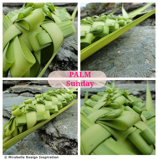
In the Christian calendar, Palm Sunday (also referred to as Passion Sunday) celebrates the triumphal arrival of Jesus Christ on colt-back in the city of Jerusalem, the week before his death and resurrection, where the population welcomed him by waving palms and laying them on his path, as a sign of gratitude.


Palm Sunday heralds the start of the Holy Week, which culminates into the Easter celebrations. Traditionally Christians take palms or box, olive, willow or yew branches to their local church on Palm Sunday for those to be blessed by the priest and bring good fortune to abodes and households. The branches are kept for one year, and laid on a mantelpiece, vanity, cabinet or other chosen piece of furniture, or placed between a cross/ holy picture frame mounted on the wall and the actual wall itself. Some Christians place the blessed palms on the graves of loved ones. Some will hang a piece of palm frond woven into a cross by the rear view mirror of their car.

Now whether you are a believer or not, you cannot fail to recognise that some of those palm pieces are works of Art all to themselves as the fresh, young and tender leaves are split, bent and painstakingly interwoven into intricate patterns, creating religious representations or more abstract ones. In Corsica, the event makes the local news every year without fail, as both the religious fervour and the craft are celebrated.


However in recent years, the local palm trees have been suffering from major setbacks in the form of red palm weevil infestations brought by trade imports from the Far East, via container ships and contaminated wood pallets. As a result, it is becoming difficult to source healthy young and tender palm. Meanwhile we need to ensure that the palm-weaving craft, a fragile piece of cultural heritage, is shared and carried through from one generation to the next, or it may one day vanish altogether once the elders and other individuals in the know are gone.

Featured here is a proud example of Corsican craft applied to Corsican palm. There is a lot going on in the technique (look at those layers!), and Mirabelle is very admirative of it! So pretty in its sophisticated simplicity!


Source: All photography by Mirabelle.

21 Jan 2016

A Wonderful Winter Wedding...

If you follow Mirabelle's sister blog La Baguette Magique, you will have found out my big news: I just got married to the loveliest man there is, Roby! Our Big Day was an intimate affair - only close family members - and no lavish ceremony. It was all about pared-down simplicity.


Though needs to be said that we forfeited neither style nor elegance. However we dispensed of the following: wedding planner, professional photographer, personal florist, bridesmaids, wedding attire, hire limo, band/ DJ, private chef... and five-course banquet for that matter. Sorry if this may not be the idea of a fairytale wedding for some of you, yet for both Roby and I, it was exactly the way we both wished our Big Day to be: low-key and fuss-free. A by-product of low-key and fuss-free meant that our wedding came out to be inexpensive, yet not in the sense of tight-fisted or cheap, i.e. lacking the essentials or attention to detail. Ours was inexpensive *and* luxurious!


Here let me share with you a few hints and tips on how to achieve an inexpensive fuss-free wedding reception that does look the part:-


Wedding Venue:
The wedding lunch took place at my parents' house.

Table Decor:
Living on an island miles from the closest town, we had to make do in terms of floristry for instance. From the local general store, my mum picked a small cream rose bush whose pot she wrapped up in foil and then wrapped in a heirloom crocheted doily held together by an elastic band. She also picked a bouquet of mixed flowers (pink carnation, chrysanthemum, red rose, gerbera, pistacia lentiscus, papyrus, etc.) that she placed in a tall crystal vase.
Flowers instantly add grace and elegance!

Table Linen:
Family heirloom embroidered white linen that belonged to my grandma, dating back to the 1930s, and still in pristine condition. Our ultra-special family occasion linen!
Making a statement with heirloom pieces...

Tableware:
Making a statement with heirloom pieces, and going tone on tone, as white on white is so chic! White porcelaine de Limoges plates. Silverware & crystalware, family heirloom pieces from early 20th century to the 1960s.
... and white on white is so chic!

Menu Fayre:
Mostly buffet style finger food for the apéritif and first course, laid out on trays placed on the dining table: canapés (of thin gingerbread slices spread with fig and walnut jam and finished off with a layer of soft blue cheese); cherry tomatoes sliced halfways and held together on cocktail sticks with a dice of artisan smoked/ cured meat in the middle; courgette (zucchini) fritters; freshly-made mushroom pizzas from the local bakery, sliced in bite-size squares, shop-bought savoury palmiers, fresh grapes, cheese bites.
The Buffet Table

Main Course:
Scallops in a white wine sauce prepared by my mum, served straight off the oven in their individual fancy ramekins. 
Dessert:
Galette des Rois, ordered fresh from the bakery. The galette is an Epiphany pastry speciality from France, made up of puff pastry filled with Frangipane (almond paste). We personalised it by serving it with homemade candied kumquat slices and caramelised persimmon slices. [P.S: If you are feeling adventurous, why not make your own Galette des Rois, from scratch! Try David Lebovitz's recipe.]
Roby's favourite French sweet is a Christmas chocolate speciality called Papillote!

Beverages:
Champagne (Charles Lafitte and Alfred Rothschild et Cie) from apéritif through to dessert. Some dry white wine served with the scallops. Mineral water and upmarket apricot juice as soft drinks.
 Afters:
Black coffee served in English china cups, and chocolate fancies, including Papillotes.
Our wedding dog Tickle never got himself in a pickle with his wedding collar on!

Source: (1) Mirabelle montage of Magical Thinking Henna Letters 'N' (Nathalie) and 'R' (Roby) by Urban Outfitters. (2-9) Photography by Mirabelle.

14 Jan 2016

Postcard Views of Vintage Bastia, Corsica

Ephemera are by essence ephemeral: marketing flyers, political pamphlets, invitation cards, menus, receipts, concert tickets, clothing labels, advertising stickers, promotional ink blotters, etc. They are notheless more than 'just' bits of printed card or paper, as some of them become valuable collectibles with the passing of time.

Postcards are interesting too. They sit like a hyphen between ephemera and photographic print. Postcards document the moment. They are individual layers of history, anthropology, art, architecture, geography and land planning, all rolled together. Postcards capture a place of interest, a group of characters in action, and freeze that moment. While on the back of the card, we get the cherry on the cake, what gives the card its personality, authenticity, hence uniqueness: a little record of a moment in a life, a few scribbled words, a signature, a condensate of graphology, an address, a stamp... Testimonies of lives past, of the frailty of the moment gone.

It doesn't take a collector to realise that postcards are an important point of reference, not only as photographic evidence to those of us interested in history. Thus it seemed natural for Mirabelle to portray a piece of our local coastal history in our local town of Bastia, French island of Corsica. Those familiar with the town will recognise it in those views (which I estimate to dating back to the 1920s). This little nostalgic exercise is still a moving experience, as I am trying to picture my Corsican grandma, great uncle and great grandparents living the moments that are pictured herein!


Source: (1-3) A short selection of hand-coloured postcard views of Bastia available to purchase from SCVIEW Antique Images & Postcards, via the Stanley Gibbons Marketplace.

14 Sept 2015

Testimonies of a Vanished America

Who is able to depict landscapes and protagonists, subjects and objects, and capture their essence better than Fine Artists? Where the writer needs to pick and choose the words in order to describe his vision, he then needs to skillfully and painstakingly apply his magic (art and methodology) to give life and body to them by stringing them together in such a way that they relay a description of the seen, and an ambience, an emotion of the unseen, of the perceived, of the meant-to-be, of the quite-not-so. Done in such a way that they imbue us readers and guide us towards our own interpretation.


There is a vote of trust and confidence going on, as the writer trustfully relays his finished piece to us readers. Now we come into play to make the book happen, come to life beyond its words laid out flatly on the physical page. The writer has handed us the script and the tools (his art form) and our role is to use them to visualise the story, the unfolding plot, the theme, the dialogues, with our mind's eye. However there is a risk for the process of going into disarray, getting lost in translation, missing a point, overlooking some not-so-anodyne punctuation mark. The reader transcribes, interprets and represents the unfolding text into visual imagery. We mentally paint the canvasses and tapestries of the book thanks to the tools provided by the writer to guide our imagination.

Our relation with the painter is different. Acute observer like the wordsmith, he is for his part the writer of the visual, skillfully using a palette of colours, shapes, shades and textures that depict contents and form. The visual artist visually sets the scene literally in our faces, yet with all the underlying nuances, subtleties, assumptions and suggestions that are dear to the writer. Yet there is no beating about the bush: the painter gets us on track sooner! The 500-page novel is condensed into the one painting, laid before us to physically see. The painting seizes the moment,without abstracting it from the peace or drama of the past and the (un)foreboding future. The moment is captured in its fleetingness, and frozen for posterity.

In this particular instance, French-born American artist Henry François Farny captured more easily than words could, the waning of an era, that of the Native Americans, now forced to surrender their freedom to the precepts of the newly-created Land of the Free in all its flaws and contradictions. Farny's paintings translate this imminence with composure, restraint and dignity, and with all due respect from an artist who was fascinated by the First Nations and their incommensurable wisdom, knowledge and symbiosis with the natural world. Before our very eyes is a piece of anthology immortalised by paint and brushes, that of a self-sufficient, fiercely independent, proud, wise, free, spirited and autonomous civilisation on the brink of its forced demise and surrender to a model that is anything but redeemable.

Sources: (1) 'Rookwood and the American Indian, Masterpieces of Art Pottery from the James J. Gardner Collection' exhibition catalogue, featuring essays by Anita J. Ellis and Susan Labry Meyn, published by Ohio University Press, 2007, and available to purchase directly from the publisher. I sourced the cover photography for this article from Google Books. The exhibition catalogue details Native American-focused art within the Ohio artist community and references local artists such as Henry Farny, as well as featuring pottery pieces by Cincinnati-based The Rookwood Pottery Company.


(2) Gouache on paper (1895) by French-born American painter Henry François Farny (1847-1916). The painting was auctioned off by Aspire Auctions in their September 2015 Online Auction. Estimate $100,000/ $200,000. Sold $138,000.00 on 3rd September 2015. The full details below originate from the Aspire Auctions website:

14 ⅞" x 8 ⅞" paper size. Gouache over pencil on paper, signed and dated 1895 lower right, framed under plexiglass, overall 19" x 13⅛". This has never been offered for sale before. Depicting a Native American Crow Indian warrior, as indicated by the two eagle feathers, scouting with shotgun to his side, his beaded-hide pipe sack tucked in his belt. In the background is a second warrior on horseback with additional horse and distant camp below the hills.

"The West to which Farny traveled in 1881 was already becoming a nostalgic subject for Americans. The frontier officially ceased to exist in 1890; a transcontinental railroad had been completed in 1869 and most of the Indians had been confined to their reservations during the 1870s. While a few indians, such as Sitting Bull and Geronimo, continued to fight white settlers with small bands of warriors, the majority of the Indians lived peacefully and dispiritedly on their reservations. The buffalo had already passed into legend by the time of Farny's visit... "Although he repeatedly used his studio artifacts in several paintings, Farny's depiction of the Indian was historically quite accurate. Many of the Indian objects in his painting can be identified by tribe. Farny sometimes dressed his models in a style of the 1860s or 1870s, and the artist often portrayed his Indians in a mixture of Indian-made clothing, trade goods, and white man's gear, as would have been accurate for his period. Generally, his Indians carry rifles, and the new repeating rifles at that, rather than the more romantic bow and arrow of legend, and they usually ride in the white man's bridle and saddle and are rarely seen bareback using a thong." - Denny Carter, author of 'Henry Farny'.

Condition: Foxing in sky, painted white border flaked at the edges not intruding into painting. Small undulation in paper as shown in detailed image. Tipped at the upper corners to backing mat. Small soils visible in upper corners from previous framing material.


(3) Gouache on paper (1911) by French-born American painter Henry François Farny (1847-1916). The painting was auctioned off by Aspire Auctions in their September 2015 Online Auction. Estimate $100,000/ $200,000. Still for sale to date (reserve has not been met). The full details below originate from the Aspire Auctions website:

6¼" x 4¾" paper size Gouache over pencil on paper, signed and dated 1911 lower right, framed under glass, overall 11¾" x 10⅛". Prov: By descent through the family, Cincinnati OH, until now.

"By the time Henry Farny made his first trip west in 1881, the Indian peoples of the entire Great Plains region, from Texas into Canada, were already greatly impoverished, culturally as well as economically. These Native Americans had endured nearly a century of pernicious federal policy and more than forty years of punishing war with the U.S. military. The government's objective was to either civilize or exterminate these proud and brave warriors.... the Indian story that Farny usually chose to tell reflected the lifeways of these Indians during the glorious earlier days of traditional Plains life, when they had charged across the grasslands hunting buffalo prior to their confinement on remote reservations.... Throughout his life Farny knew about and was sympathetic to the Indian's cause, yet his art rarely reflected their tragic situation. Because of the discrepancy between what he knew and what he chose to portray, Farny's paintings and drawings of Indians are fascinating from an ethnological viewpoint." - Susan Labry Meyn, author of 'Henry Farny Paints the Far West'.

Condition: Painted white border flaked at the edges not intruding into painting. Verso paper toned with old tape residue from non-archival framing.

'The Coming of the Fire Horse' (1910)
'New Territory' (1893)
'Camp in the Foothills' (1895)

Other artworks by Henry F. Farny include (4) 'The Coming of the Fire Horse', oil on canvas (1910), and (5) 'New Territory', gouache on paper (1893), both via The Athenaeum - which references no less than 81 paintings by Farny. (6) 'Camp in the Foothils', gouache on paper (1895), via Fine Western & American Art Auction House The Coeur d'Alene Art Auction.

15 Aug 2015

The Tile Files: Majolica

In interior design and the decorative arts, an Italian noun that rolls off the tongue in a little dance usually has a lot of premise to it, and Majolica is one of those words! Welcome to Mirabelle's monthly design series, The Tile Files. We've had quite a journey so far, from Tomettes to Mosaics, via Azulejos and Delftware, and right now we are about to embrace the wondrousness of Majolica in its bold design, rich decorative layers, deep strong colours and endearing crackled glaze. 

Tin-glazed Earthenware Dish, via The Metropolitan Museum of Art

As much as Majolica is mellifluous by name and by nature, it seems that its heyday is being reinvented by every major art movement. First off, Majolica is a generic term. Scratch its veneer and you find a confluence of timelines and spaces, yet rooted in the same influences. For the purpose of our tile-based research, we aim to concentrate mostly on Victorian Majolica decorative tile, although we need to be aware of other variants of the ware, most notably the decorative tin-glazed earthenware of Maiolica, popular in Italian Renaissance (14th-16th century). The name is believed to be a Medieval Italian reference to the Balearic island of Majorca, a pottery stopover on the Hispano-Moresque wares trade route to Italy. Maiolica ware was mostly used for presentation dishes, drinking vessels and apothecary jars. The designs on the wares depicted a scene or told a story as istoriato wares do.

Art Nouveau Floral Majolica Tile, via Tile Heaven

In general, Victorian Majolica is known to be brightly coloured, richly adorned, layered, moulded and embossed, with emphasis upon florals and curves. Contrasting from the multi-coloured designs are the monochrome ones, which play on the depth and intensity of one single colour, from deep and dark to watered down to a watercolour effect. Closely-guarded trade techniques produce the high-gloss lead-glazed finish, with other effects of translucency and opacity being also achieved. Alongside colour and finish, relief techniques were achieved, by means of cloisonné, tube-lining (a.k.a. slip-trailing), or barbotine (raised painted slip decoration). Stencilled slip tile designs befit the streamlined industrialised processes. Meanwhile the advent of the Arts & Crafts Movement and Art Nouveau will confer Majolica a modernist, angular and voluptuous decorative edge that bridges the gap between the 19th and 20th century.

Art Nouveau Majolica Tile, via Tile Heaven

Historically-speaking, Mintons Ltd. (part of The Minton Tile Companies) is the English pottery manufacturer that is the most associated with Victorian Majolica. The firm started off under Thomas Minton, producing blue transferware for dinnerware, including the popular Chinese-inspired Willow pattern. His son Herbert Minton took the family business to pastures new (with a resolutely modern, design-led approach), branching out into decorative encaustic tiles, and forming partnerships with designers and architects in the process, attending worldwide trade fairs and gaining recognition as high-profile contracts were signed. Minton took on French engineer Léon Arnoux as Art Director and the latter produced Majolica coloured glazes that gained a lot of attention at the Great Exhibition of 1851.

As much as the second half of the 19th century had heralded Majolica's heyday, the 20th century took the fortunes of the English pottery industry as a whole into disarray, through a series of mergers and restructurations that progressively squeezed innovation out of the production model and with it the richness that had been experienced in earlier times. Staffordshire, the pottery county of Britain par excellence, took a hard blow in the process. This bittersweet statement shouldn't prevent us from admiring and appreciating those designs of the past that actually appear so contemporary and fresh through their choice of bold colours and inventive motifs.

Art Nouveau Tile by Sherwin & Cotton, via Art Nouveau Tiles

Sources: (1) Tin-glazed Earthenware Dish, late 14th century, Tuscany, Italy, via The Metropolitan Museum of Art. (2-3) via - and available to purchase from - Tile Heaven. Let us note in passing their interesting history of art section on Majolica. (2) Art Nouveau Floral Majolica Tile, manufactured in the U.K. by Corn Bros, circa 1900, features the popular Victorian and Art Nouveau theme of foliage and florals. The central motif resembles a blue poppy, with a foliage border surround. Interestingly the motifs sit at the intersection between Victoriana and Art Nouveau, with signs of Victorian exuberance, as opposed to the more rigid and restrained (stylised) geometric representations of Art Nouveau, as found for instance in the (3) Art Nouveau Majolica Tile, manufactured by id., circa 1905. Further fine examples of Majolica tiles may be viewed from Tile Heaven. (4) Art Nouveau Tile, circa 1910, by Sherwin & Cotton (1877-1911), via Art Nouveau Tiles. The website boasts a fine Art Nouveau collection, with some stunning examples by the likes of Marsden Tile Works, Alfred Meakin and Pilkington.

11 Aug 2015

Tiny Housing, Grand Living: Orii di Corsica

Welcome to our brand new series, Tiny Housing, Grand Living. Herein Mirabelle explores compact living habitat under all its guises, spanning climates, cultures and timelines. I am starting off with a bang and a WOW! of wonder, with the integration of tafoni (honeycombed rock surfaces) into the built environment, with whimsical faerical results! Just follow me down the southern part of the Mediterranean island of Corsica.

Those under-rock troglodyte shelters are called Orii in Corsican (Oriu, singular). They look like they might have - either directly or coincidentally - influenced  fantasy authors (and graphic artists!), and one would be forgiven for thinking Tolkien and The Smurfs Village as they tread the smooth rockfaces and climb the sea-salt-polished boulders surrounding those enchanted mushroom-shaped dwellings. The shelters are perfect examples of a harmonious integration of nature into human habitat.

Originally used as shelters in prehistoric times (as far back as 7,000-10,000 BC), those peculiar ground-level caves were later rendered more habitable by nomadic shepherds who erected dry-stone walls to close off openings. The shelters were also used as granaries. Oriu di Grossetto (pict 1-2) depicts this fascinating contrast between the smooth mushroom-like cap and its weathered, hollowed basis. Meanwhile Oriu di Canni (pict 4-6), with its pointed spire-like structure, resembles a chapel. This article being only a synopsis, many more Orii of note are to be contemplated at Ma Corse!


Sources: (1) Double Oriu di Grossettu and (2) Arche du Chaos de Grussettu (Grossetto Tafoni Arch), photography by Corse Sauvage, via Flickr (18-Jan-2012). Further details (in French) from their informative website, Blog Corse Sauvage. (3) Oriu de Caldarello, photography by Ma Corse (Jean-Marie Vergès). Further details (in French) from their comprehensive Orii section. (4) Oriu di Canni, photography by Christian Comiti, via Flickr. (5) Oriu di Canni, photography via Perierga (article in Greek). (6) Oriu di Canni, photography by Loïc Colonna. (7) A tafoni close-up (for reference only): Tafoni Sandstone Rock, from El Corte de Madera Park, San Mateo County, California, photography by randomtruth, via Flickr. "Tafoni are small cave-like features found in granular rock such as sandstone, granite, and sandy-limestone with rounded entrances and smooth concave walls, often connected, adjacent, and/or networked. They often occur in groups that can riddle a hillside, cliff, or other rock formation. They can be found in all climate types, but are most abundant in intertidal areas and semi-arid and arid deserts. Currently favored explanations controlling their formation include salt weathering, differential cementation, structural variation in permeability, wetting-drying, and freezing-thawing cycles, variability in lithology, case hardening and core softening, and/or micro-climate changes and variation (i.e. moisture availability). Tafoni have also been called fretting, stonelace, stone lattice, honeycomb weathering, and alveolar weathering." (source: Wikipedia).
Related Posts Plugin for WordPress, Blogger...